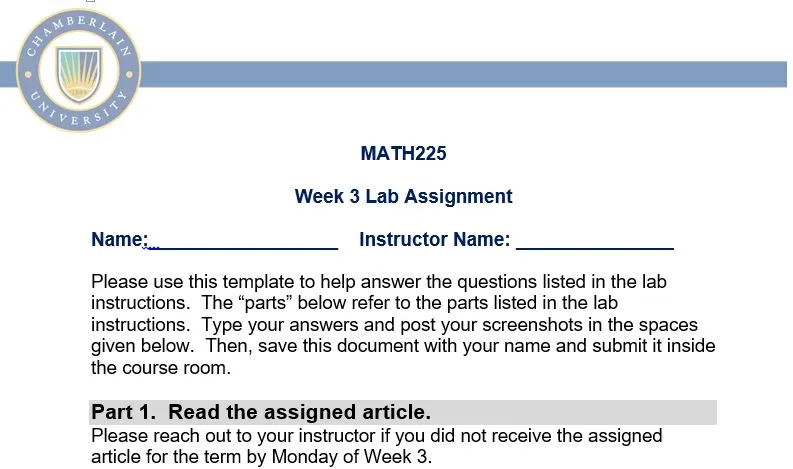
MATH225N Week 3: Lab Assignment
Assignment
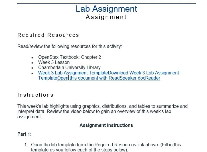
Required Resources
Read/review the following resources for this activity:
- OpenStax Textbook: Chapter 2
- Week 3 Lesson
- Chamberlain University Library
- Week 3 Lab Assignment TemplateDownload Week 3 Lab Assignment TemplateOpen this document with ReadSpeaker docReader
Instructions
This week’s lab highlights using graphics, distributions, and tables to summarize and interpret data. Review the video below to gain an overview of this week’s lab assignment.
Assignment Instructions
Part 1:
- Open the lab template from the Required Resources link above. (Fill in this template as you follow each of the steps below).
- Read the article supplied by your instructor. (You will find a graph OR table within the article, and then draw conclusions about the table or chart you chose and describe other ways that the same data could be presented).
- Fill in the name of the article on the template: “Review of [Name of Article].”
- State the Author on the template.
- Summarize the article in one paragraph.
Part 2:
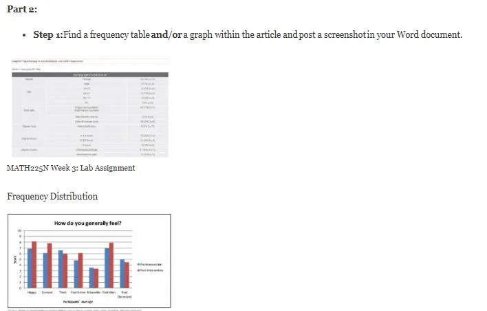
- Step 1:Find a frequency table and/or a graph within the article and post a screenshot in your Word document.
Frequency Distribution
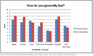
Graph
- Step 2:Answer the following questions about your table or graph.
-
- What type of study is used in the article (quantitative or qualitative)? Explain how you came to that conclusion.
- What type of graph or table did you choose for your lab (bar graph, histogram, stem & leaf plot, etc.)? What characteristics make it this type (you should bring in material that you learned in the course)?
- Describe the data displayed in your frequency distribution or graph (consider class size, class width, total frequency, list of frequencies, class consistency, explanatory variables, response variables, shapes of distributions, etc.)
- Draw a conclusion about the data from the graph or frequency distribution in the context of the article.
- How else might this data have been displayed? Discuss the pros and cons of 2 other presentation options, such as tables or different graphical displays. Why do you think those two other presentation options (i.e., tables or different graphs) were not used in this article?
- Explain how the alternate presentation options would be constructed.
- Give the full APA reference (with the correct capitalization of the title!) of the article you are using for this lab.
- Step 3: Be sure your name is on the Word document, save it, and then submit it under “Assignments” and “Week 3: Lab”.
Solution
Part 1. Read the assigned article.
Please reach out to your instructor if you did not receive the assigned article for the term by Monday of Week 3.
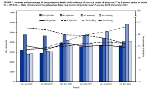
Title: Review of Routes of Drug Use Among Drug Overdose Deaths — United States, 2020–2022
Author(s): Lauren J. Tanz; R. Matt Gladden; Amanda T. Dinwiddie; Kimberly D. Miller; Dita Broz; Eliot Spector; Julie O’Donnell.
Summarize the assigned article in one paragraph. Make sure to quote and interpret at least one statistic.:
This CDC report analyzes the changing routes of drug use in overdose deaths across 28 U.S. jurisdictions between 2020 and 2022. The study, using data from the State Unintentional Drug Overdose Reporting System, found a significant shift from injection to noninjection routes, especially smoking. Over the study period, “the percentage of overdose deaths with evidence of injection dropped by 29.1% (from 22.7% to 16.1%), while deaths…..
Part 2. Choose ONE Graph, Table or Chart from the article.
Post a screenshot of ONE graph, chart or table from the assigned article (The article may have more than one chart/table/graph but you only choose one to analyze in this lab):
Get full solution for $15.00